
Aena Aeropuertos is the world's leading airport operator. It manages 46 airports and 2 heliports in Spain and participates directly and indirectly in the management of another 24 airports worldwide.
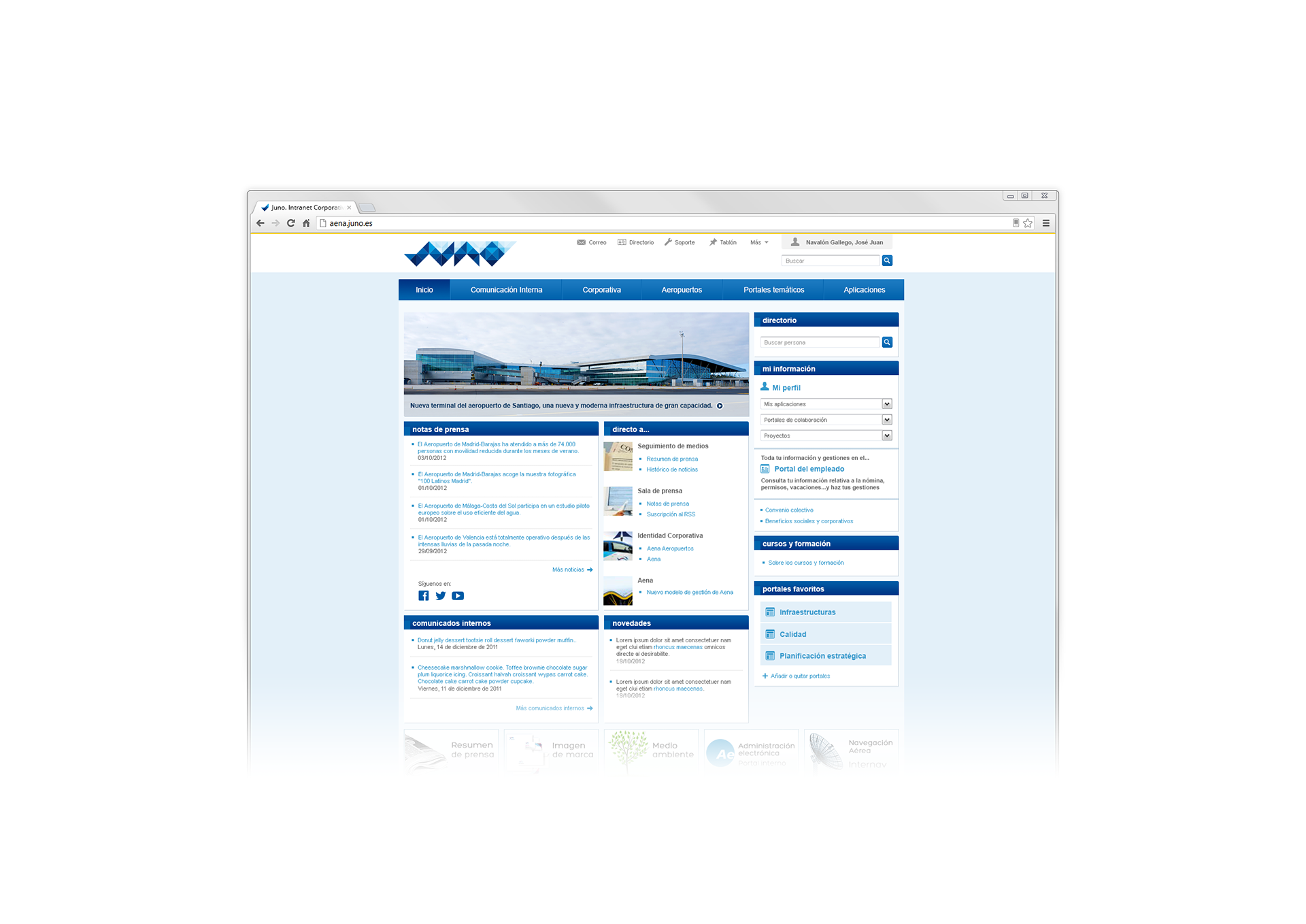
They wanted a fresh and updated look for their corporate Intranet, independent and different from the public branding, so I created a completely new identity and website UI for employee internal use.
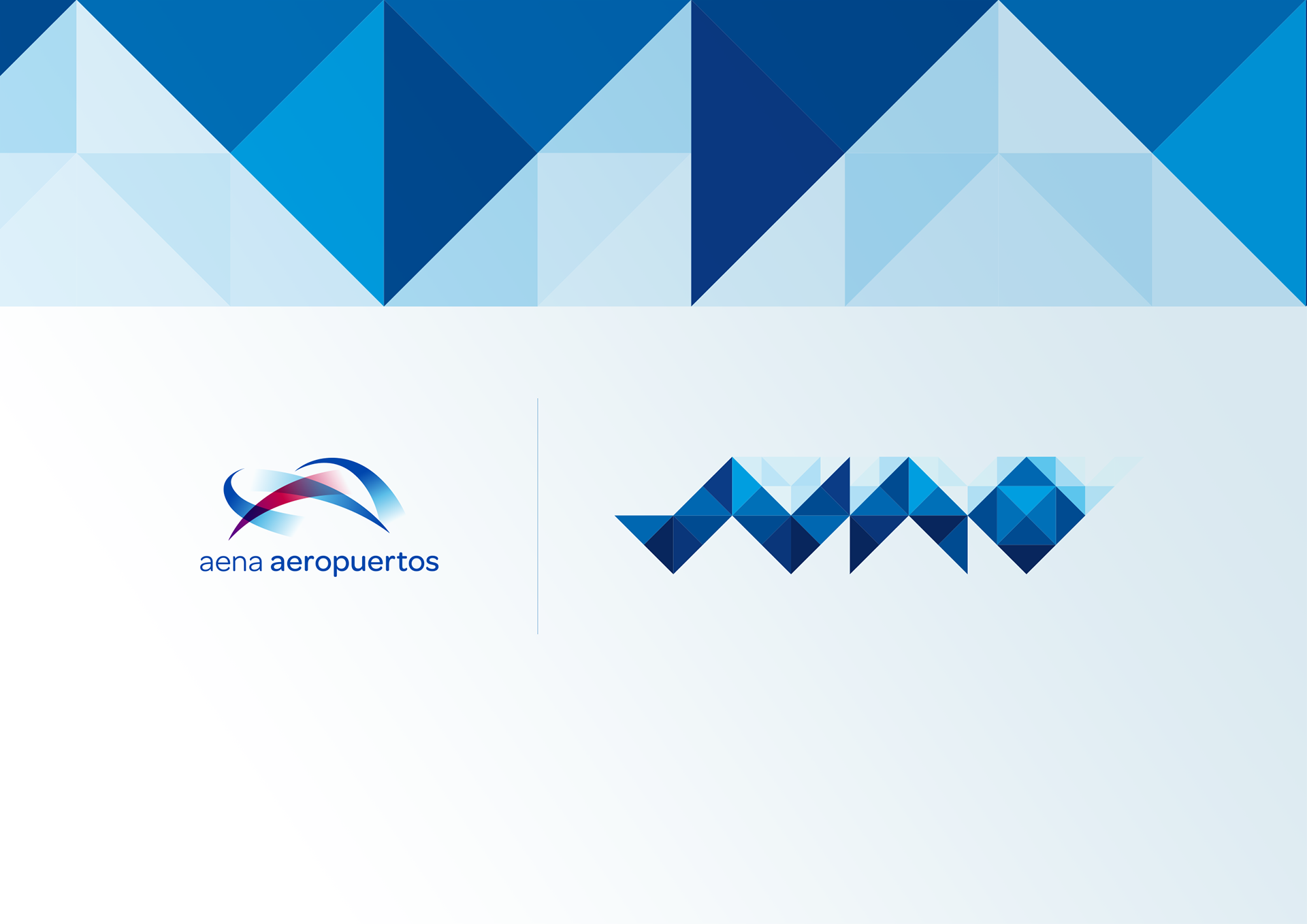
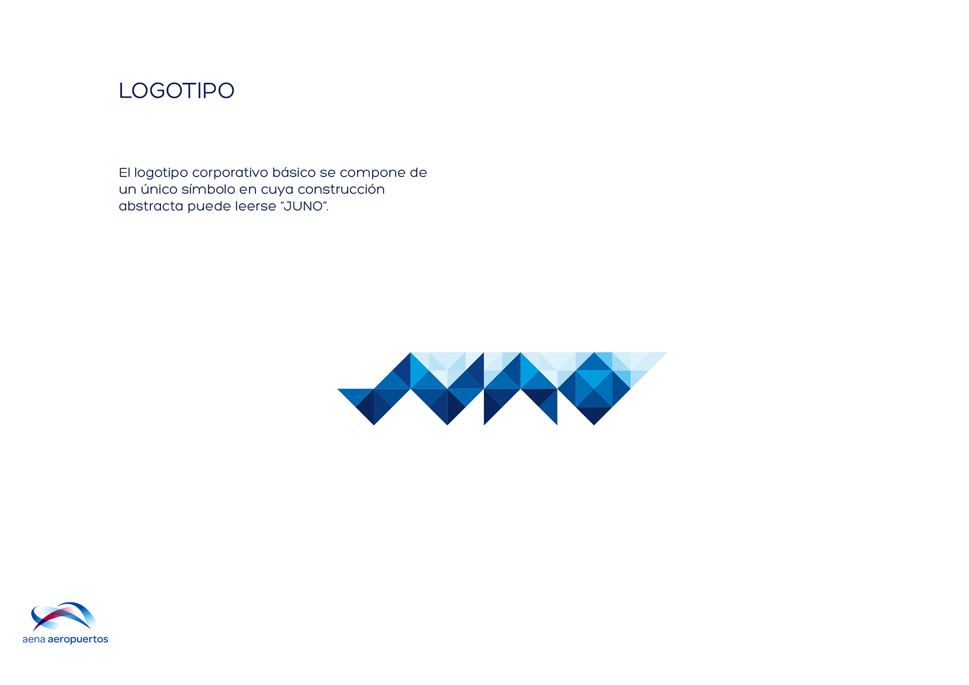
LOGOTYPE
The corporative logotype is built with a single symbol which resembles the word JUNO.
INSPIRATION
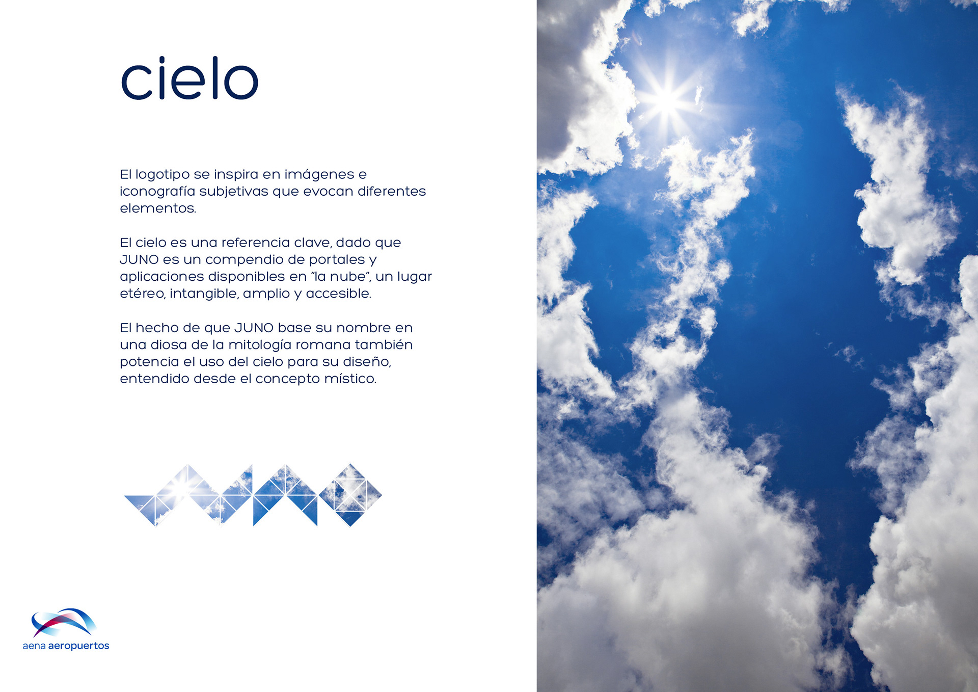
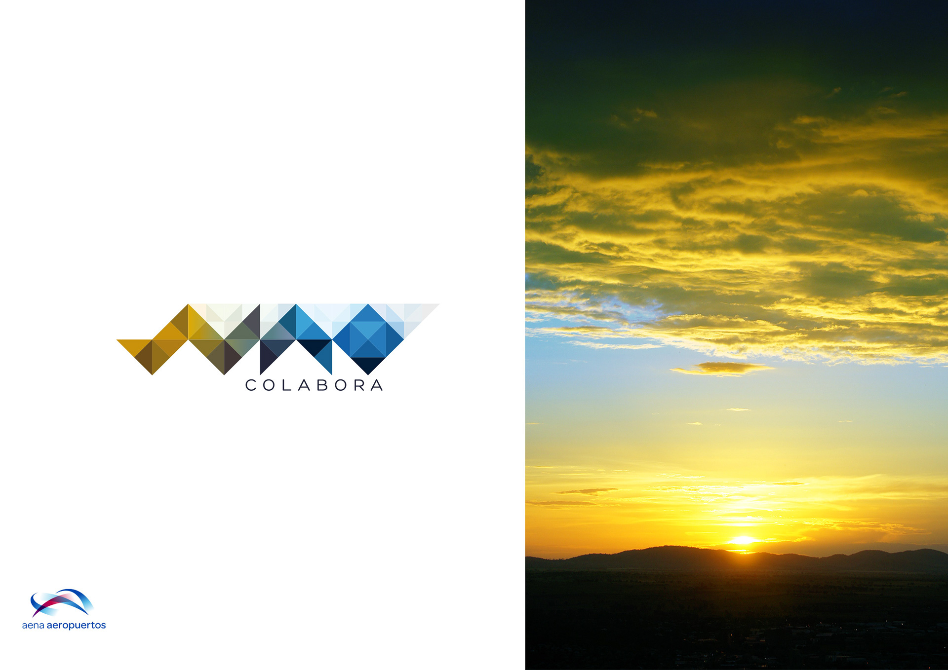
Sky
The logotype is inspired by iconography and imagery that evoke subjective elements.
The sky is a key reference, since Juno is a compendium of portals and applications available in the "cloud": an ethereal, intangible, comprehensive and accessible place.
The fact that Juno takes her name from the goddess of power in Roman mythology also strengthens the meanings of sky to be used in the design, understood from the mystical concept.
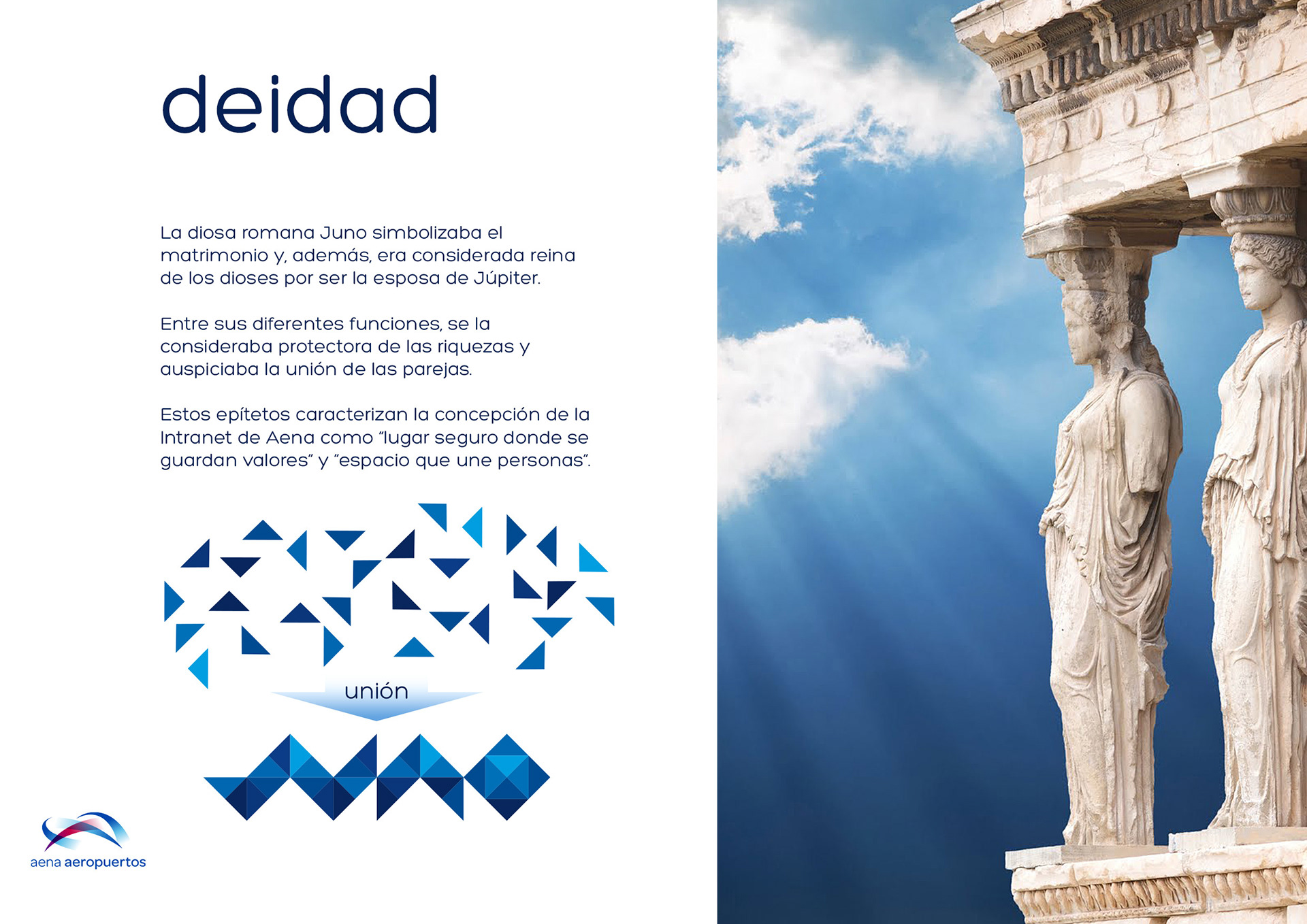
Divinity
The Roman goddess Juno symbolizes marriage and was considered queen of the gods for being the wife of Jupiter.
Amongs her various functions, she was considered protector of wealth and was sponsoring the union of couples.
These epithets characterize the design of the Aena's Intranet as "the safe place where you store values" and "the space that unites people".
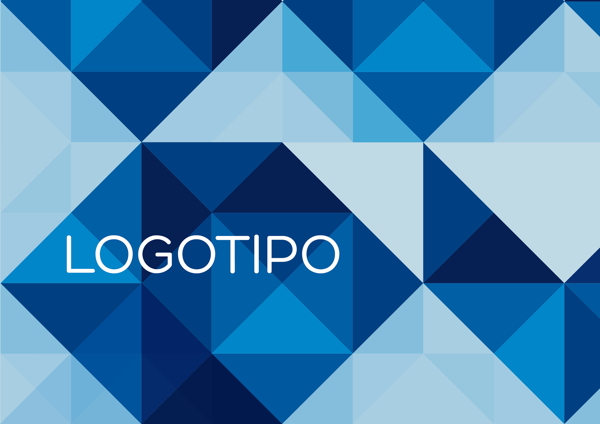
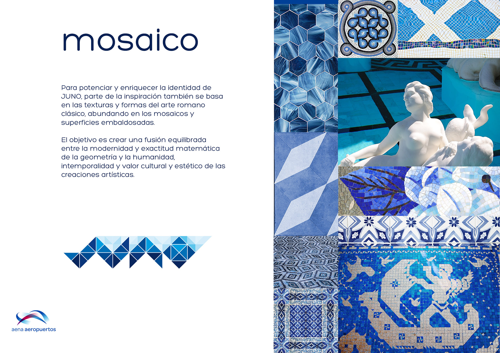
Tile
To enhace and enrich Juno's identity, part of the design is also based on the textures and forms of classical Roman art, abounding in mosaics and tiled surfaces.
The aim is to create a balanced fusion between the modernity and mathematical accuracy of geometry... and the humanity, timelessness, cultural and aesthetic value of artistic creations.
VERSIONS
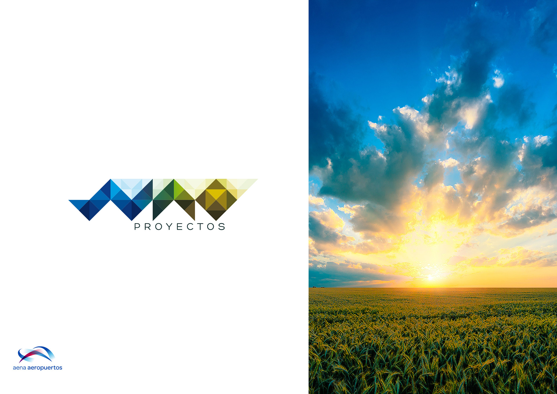
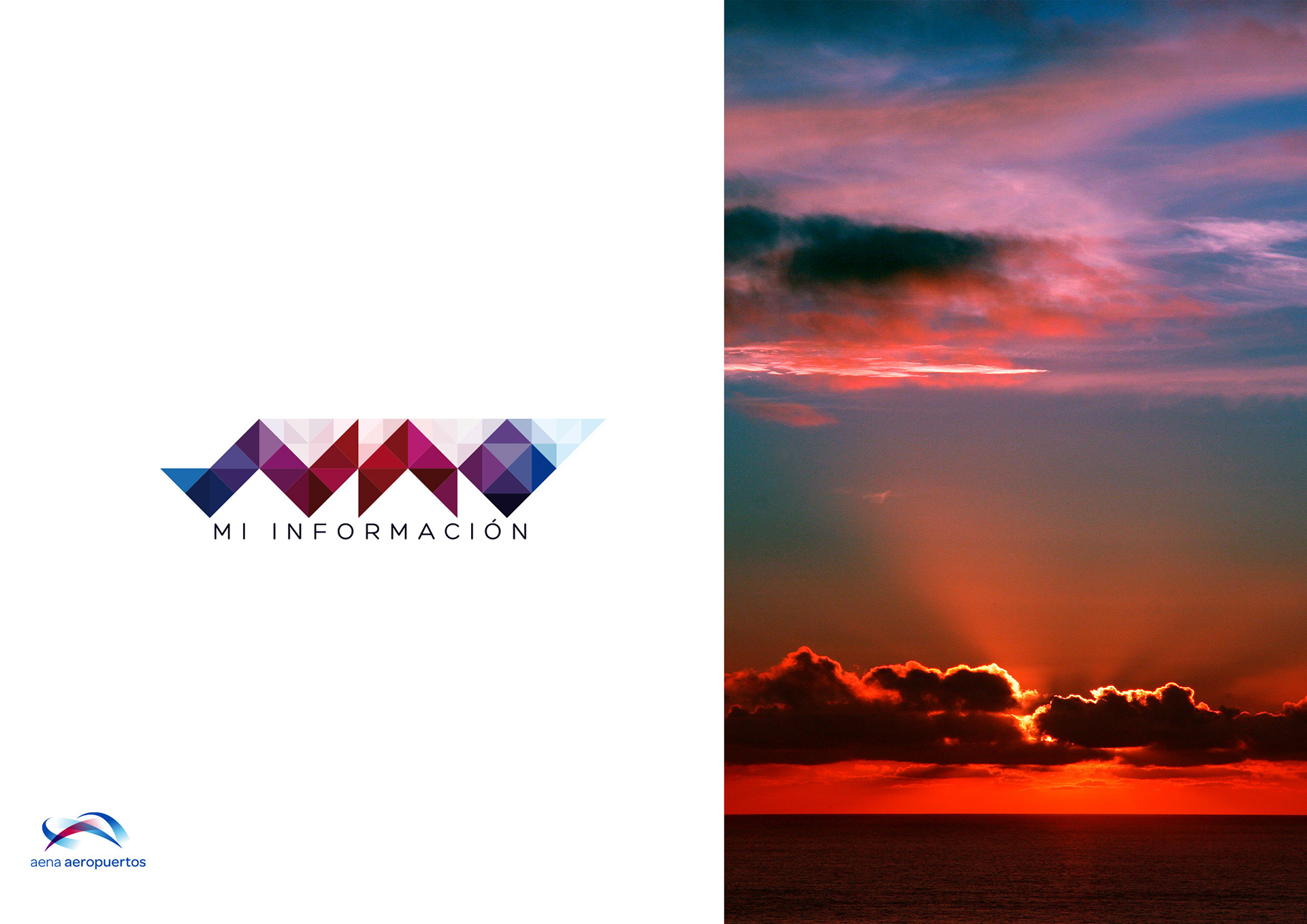
I created eight versions of the logo to make easy distinction between special areas of Aena's Intranet, or specific purposes, devices and documents.
Juno Proyectos
Juno Mi Información
Juno Colabora
Technical testing and editorial creation sub-sites:
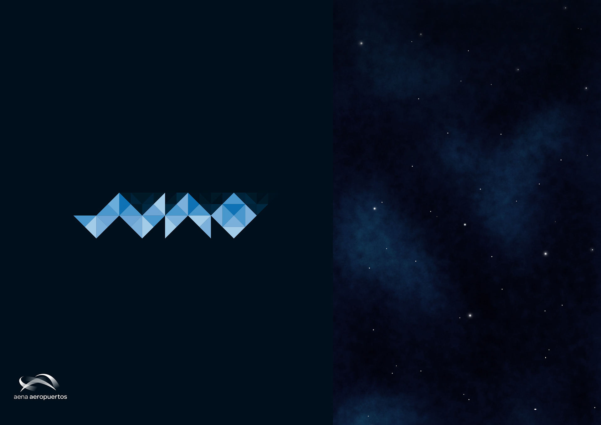
Reverse version:
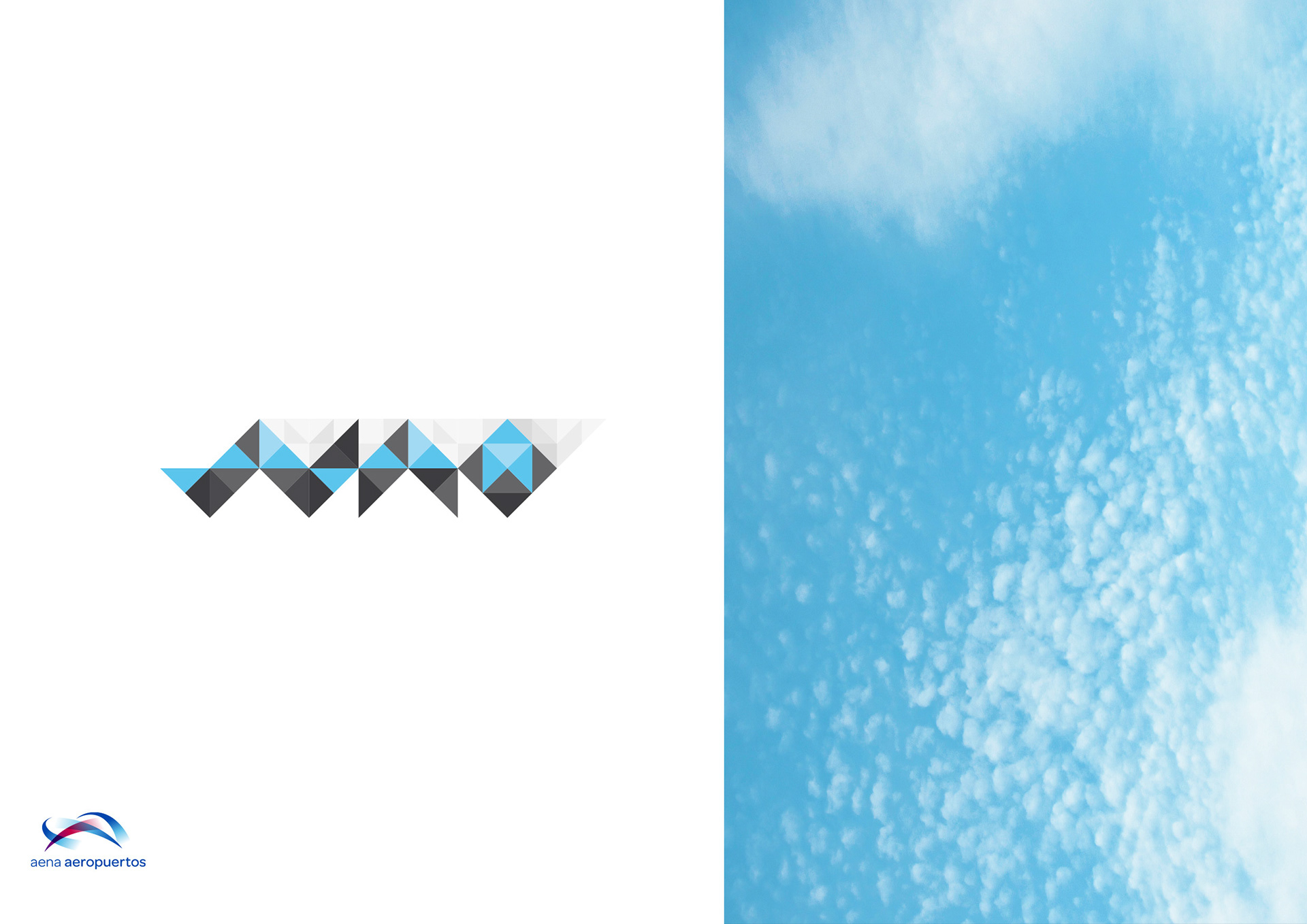
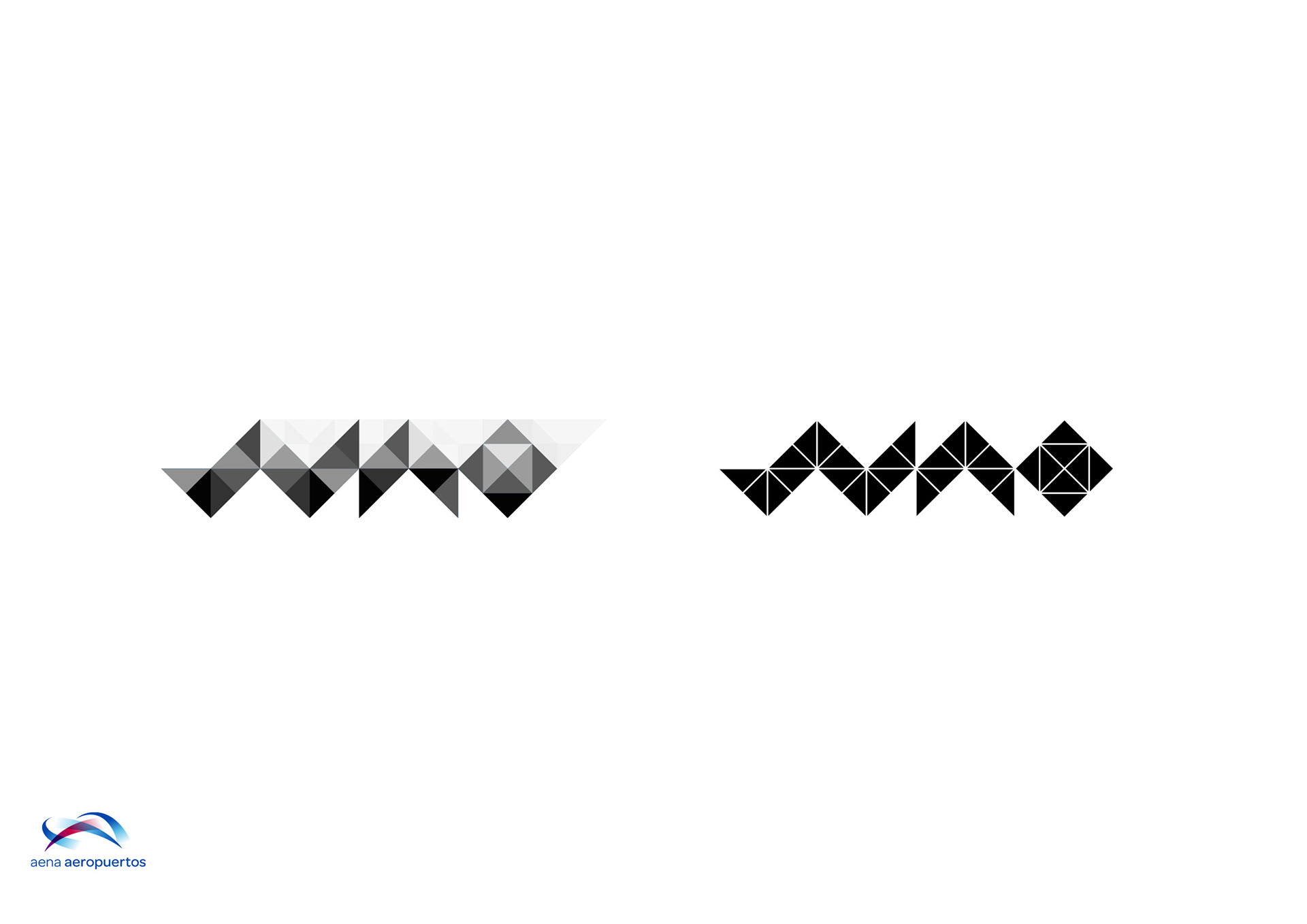
Grayscale and black versions:
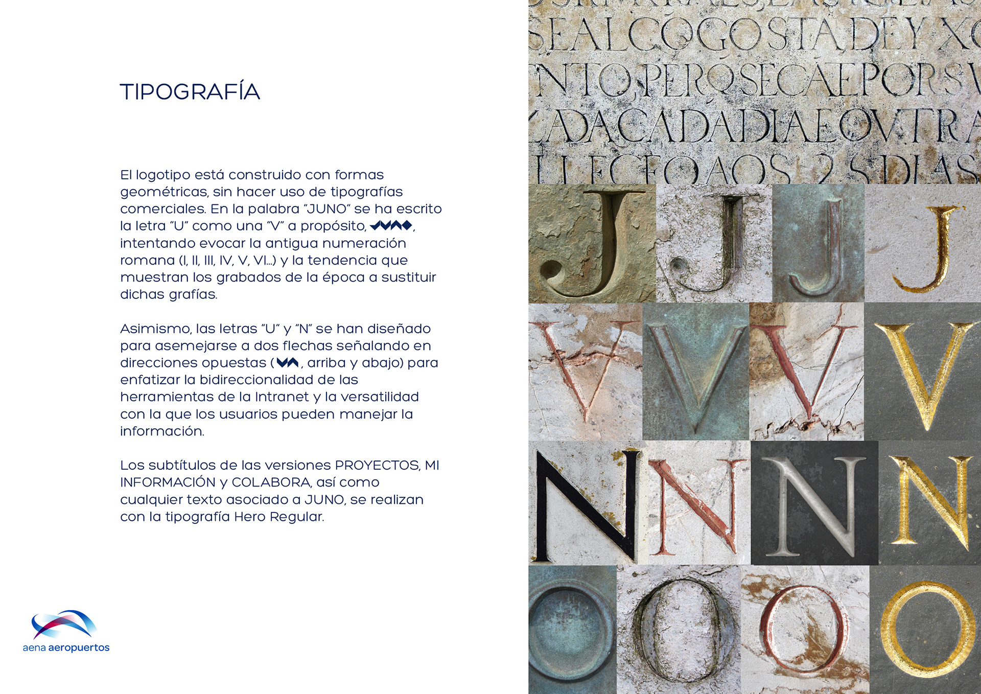
TYPOGRAPHY
The logo is constructed of geometric shapes, without making use of commercial typefaces.
The word JUNO shows the letter U as a V on purpose, trying to evoke the old Roman numerals and the engravers' tendency to replace these symbols.
Also, the letters U and N are designed to resemble two arrows pointing in opposite directions (up and down) to emphasize the bidirectionality of the Intranet's tools and its versatility to manage pieces of information.
Any associated text is made with the Regular Hero typeface.
WEBSITE INTEGRATION
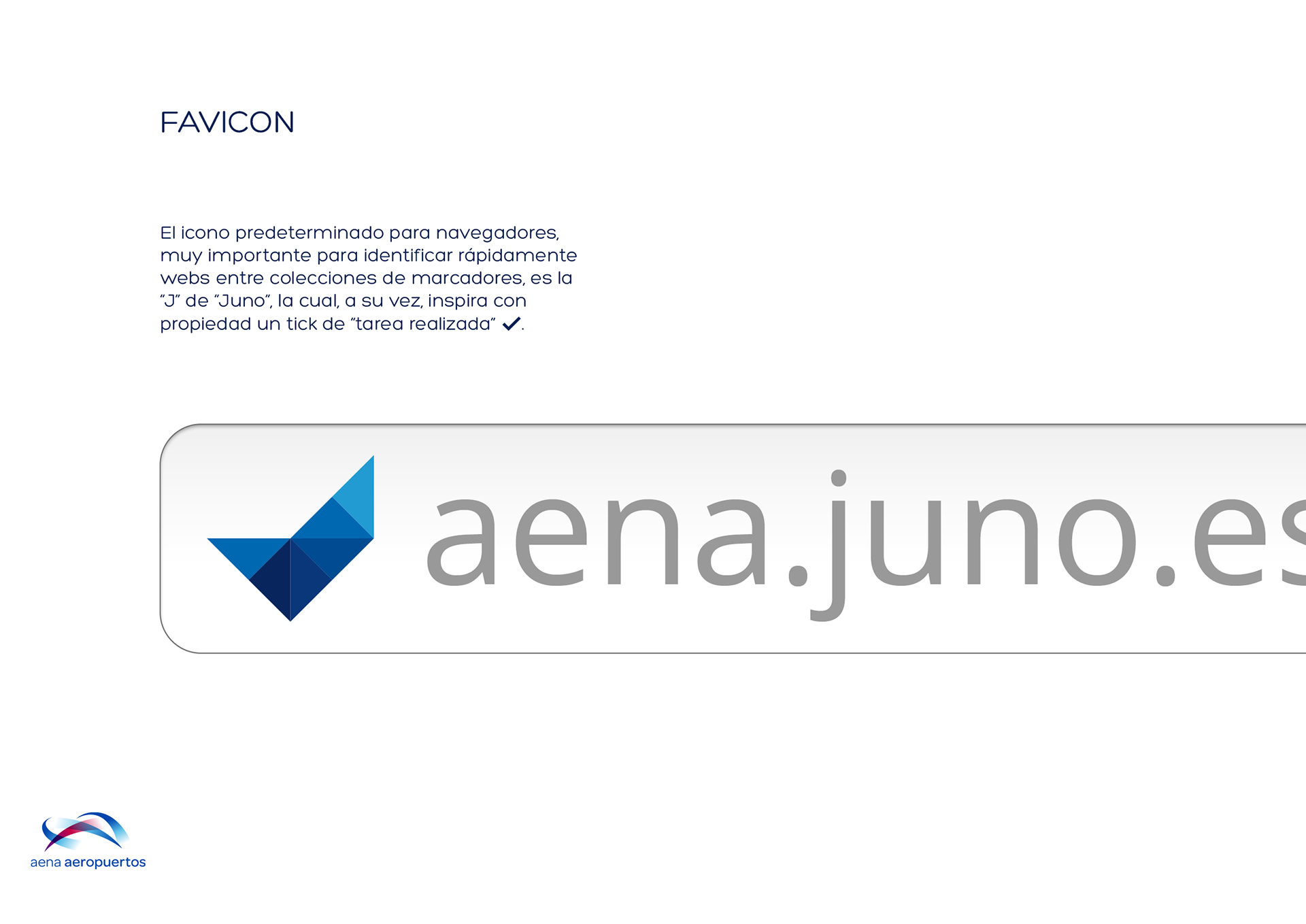
FAVICON
The default icon for web browsers (an important piece to quickly identify sites between bookmarks collections) is the letter J which, in addition, inspires properly a "work done" tick.