Madrid Unified Rail Network for Underground, Suburban and Tramways
In Madrid capital city there's no unity for the different rail network operators. Each one edits a different map of their networks, forcing the traveler to check up to 4 different maps in order to prepare their route in cases where it is necessary to transfer between different networks, although this has been slightly simplified with the use of mobile apps.
From a tariff perspective, Madrid hasn't got a unified system that allows transport without worrying about transfer supplements, except for some passes that allow movement with certain restrictions.
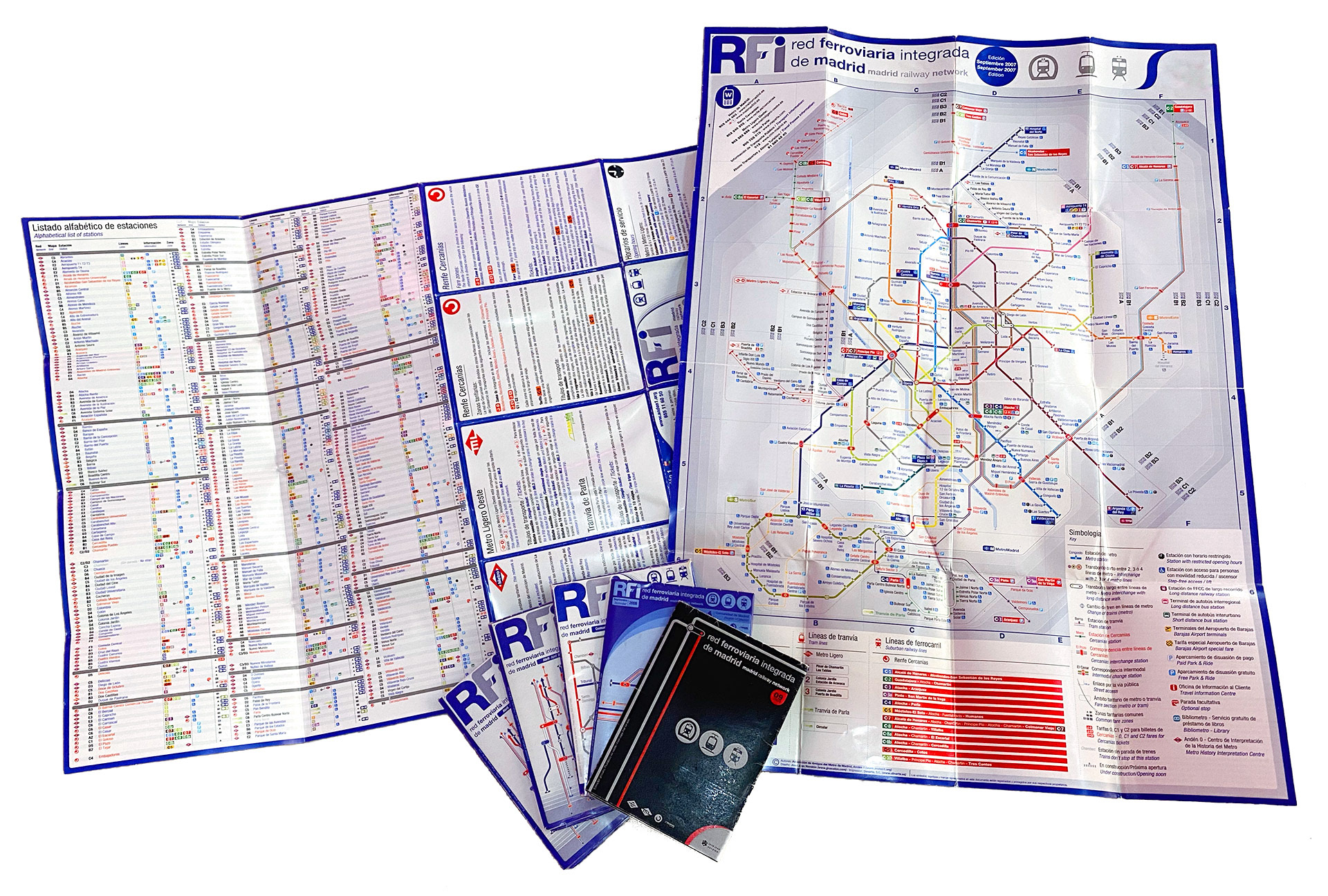
That's why I designed a unified visualization of all networks in a single document, allowing travel planning from point A to point B at a single glance, trying to respect every company branding and stick to what the traveler expects to see and what kind of signs is used to.
I released the first edition in 2007 with great media success, having good impact and getting to be interviewed by local and national media, both in the press, radio and television.
Below you can see how the project has been evolving until today, with every edition (internally and lovingly named after cosmic objects).
First edition, Geoda, 2007
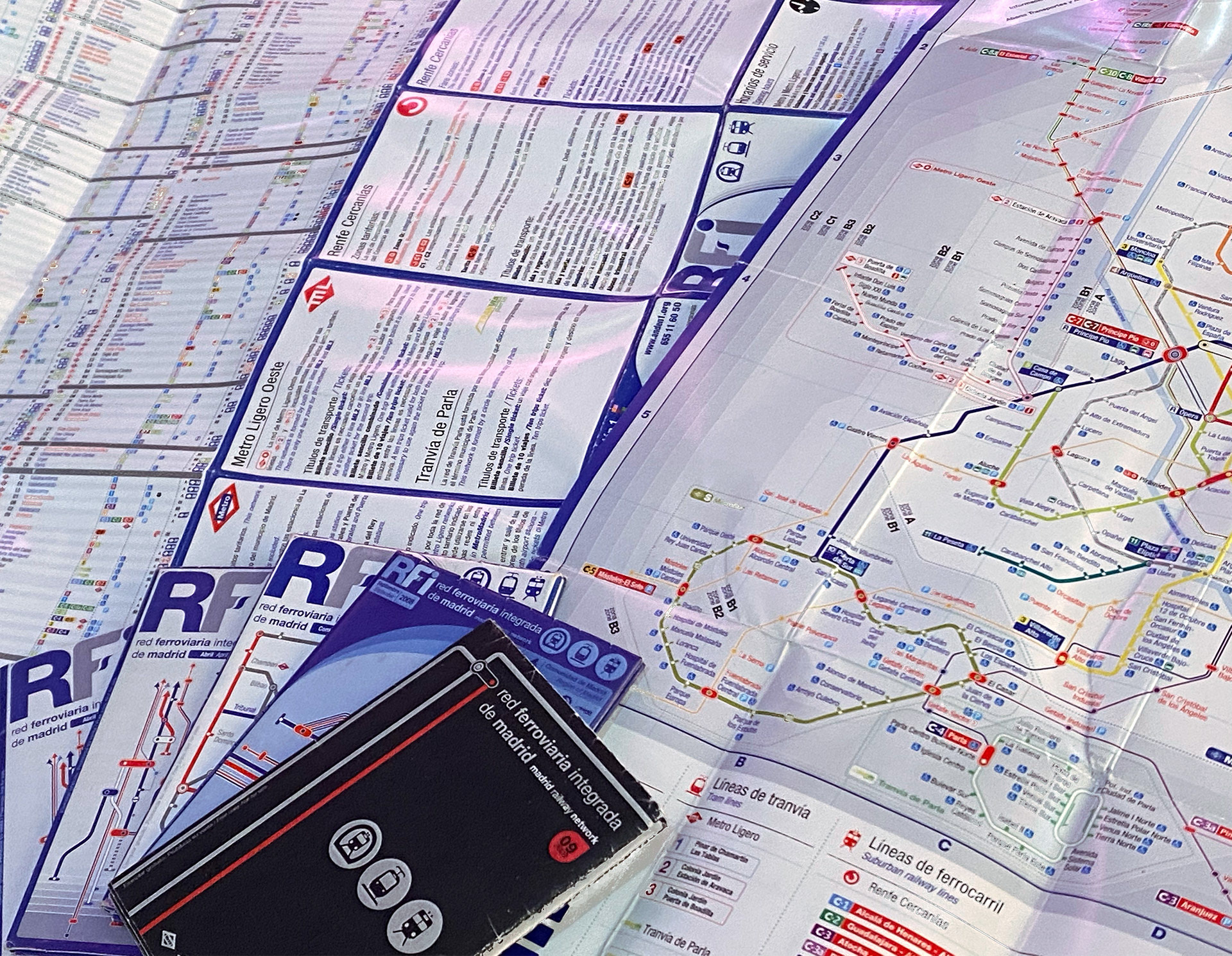
Printed version in pictures, with a branding evolution:
In the news...
Telemadrid TV:
"El País" newspaper:
"A unified map to move on wheels" (in Spanish)
"The 100-parents map" (in Spanish)
"El Mundo" newspaper:
"The map you'll never see at your station" (in Spanish)
Microsiervos:
Pomegranate, 2008 edition
Stardust, 2009 edition
Magnetar, 2010 edition
Wolf-Rayet, 2011 edition
Nebulæ, 2012 to 2016 editions
Higgs, from 2018 to today
Additional designs for signs and schematic lines
Download


